Design
Every hero needs a supporting cast. Icons aren't the main character, but they add visual interest and meaning to copy.
Meta icons
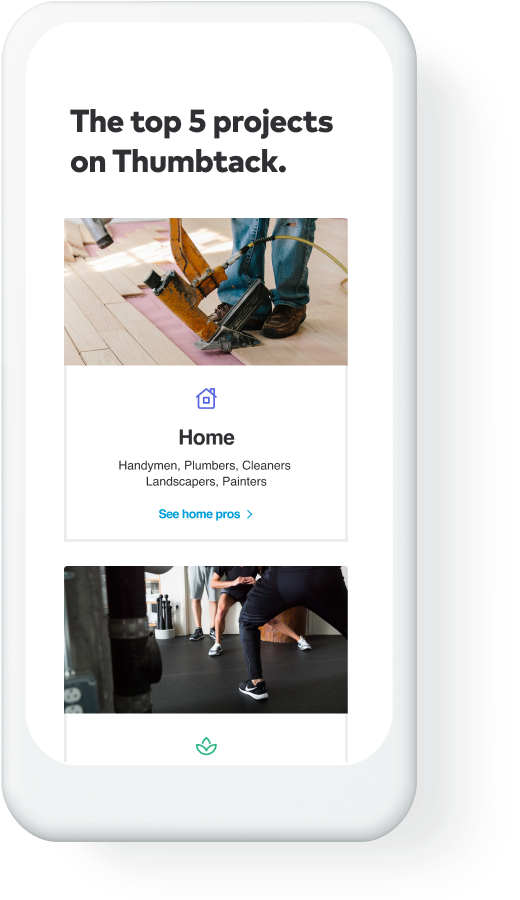
Thumbtack services are grouped into “meta-categories” with corresponding icons. A house for Home, a cake for Weddings and a hand for Personal because, well, it made sense at the time.
Home
Events
Weddings
Wellness
Business
Lessons
Personal
Pets
Design & web
Repair
Crafts
Legal
UI icons
These add context alongside copy in product. You can borrow them for marketing purposes, but don’t change the icon’s original meaning. For example, if you recreate the pro list in an ad, don’t use the medal icon to replace the Top Pro badge.
Miscellaneous icons
We also have a collection of seasonal or — dare we say it — “fun” icons that can be used in marketing. Make sure the context is clear and that they don’t steal the show.
Using color
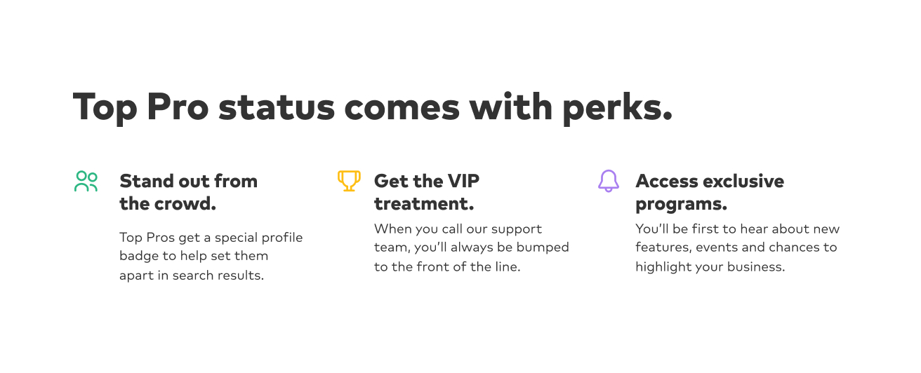
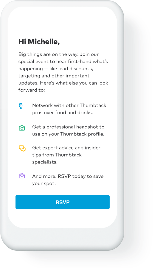
Icons in secondary colors can liven up layouts with a lot of text. Warning icons should be red, but otherwise icons don’t have assigned colors. Read more about color >
Iconography don’ts
Don’t add container shapes around icons.
Don’t use icons as illustrations, graphic elements or patterns.
Don’t replace meta icons with UI or miscellaneous icons.


